PowerSource — Product Catalog and Selection Platform
Unified product catalog, selection tools, and documentation into a single platform — one of the first Danfoss products built on the new platform foundation.
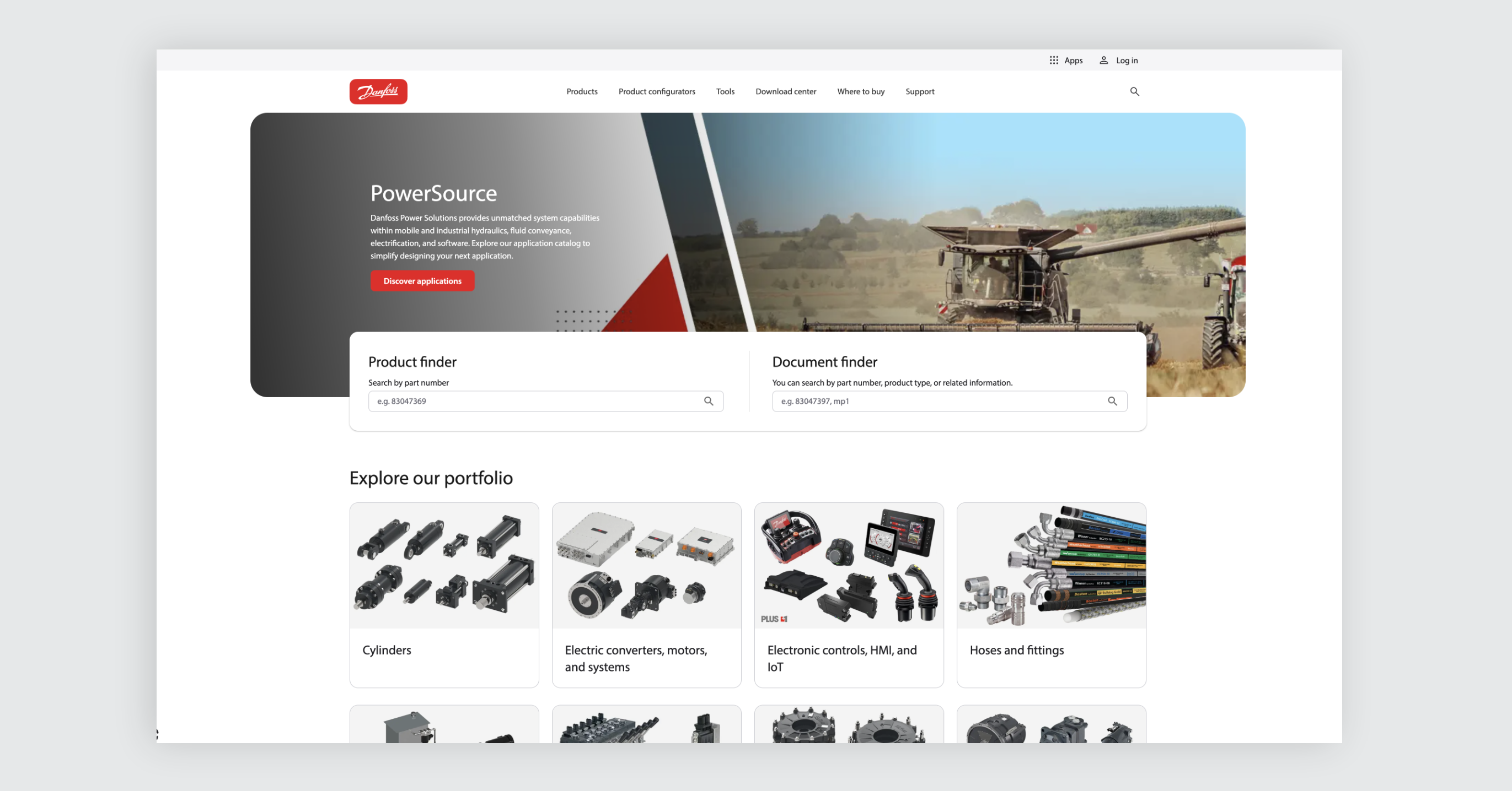
PowerSource was the first Danfoss product built on the new platform foundation and the Mosaic design system. I designed it end-to-end — from blank wireframes through usability testing to launch and beyond — and it became an early example of how the new foundation and Mosaic worked together in a real product.
Danfoss Power Solutions had a problem that’s common in large industrial companies: the tools and information customers needed were spread across multiple systems. Product catalogs lived in one place, configuration tools in another, documentation somewhere else. Customers had to jump between platforms to do what should have been one continuous task — finding and selecting the right product. PowerSource was built to fix that.
The challenge
The core challenge was combining things that had always existed separately. Product catalogs, comparison tools, technical documentation, and configuration utilities all had their own logic and user expectations. Merging them into one coherent experience meant rethinking how customers move through the process of selecting a product — not just putting everything on the same website.
There was also a technical dimension. Because PowerSource was among the first products using the new platform foundation and Mosaic components, we didn’t have many reference points. We were building the product and learning the new foundation at the same time.
The solution
I started by creating low-fidelity wireframes to explore the structure — how different tools and content types would sit together, what the main navigation paths would look like, and where the entry points should be. These early wireframes weren’t meant to look good. They were meant to generate conversations and surface disagreements early.
And they did. We went through many rounds of alignment with product, engineering, and business stakeholders using those wireframes as a shared reference. That part of the process — testing ideas in meetings, adjusting based on feedback, getting people to commit to a direction — took significant effort but saved time later.
Once the structure was solid, I designed a high-fidelity prototype of the main site area. This was used for usability testing with real customers, conducted together with a UX usability specialist. The testing confirmed some of our assumptions and challenged others. For example, we added a Product Finder feature expecting customers to search by part number — but testing showed they also used it to browse and discover product categories, which changed how we positioned it.
Based on the test results, we refined the prototype and prepared it for development handoff. During implementation, I stayed closely involved to make sure the UX intent survived the transition from design to code.
The outcome
PowerSource launched as a unified platform that brought product discovery, selection tools, and documentation together in one place — something that didn’t exist before in the Danfoss Power Solutions digital landscape.
It also became an early, working example of how the new platform foundation and Mosaic design system came together on a real product with real users.
After launch, the work continued. I added functionality like a release notes page, a personal configuration area, and migrated tools from the previous platform — making sure the product kept growing based on what users actually needed.